.elementor-1125 .elementor-element.elementor-element-2cf2287{--display:grid;--min-height:74px;--e-con-grid-template-columns:repeat(1, 1fr);--e-con-grid-template-rows:repeat(1, 1fr);--grid-auto-flow:row;--overlay-opacity:0.51;}.elementor-1125 .elementor-element.elementor-element-2cf2287::before, .elementor-1125 .elementor-element.elementor-element-2cf2287 > .elementor-background-video-container::before, .elementor-1125 .elementor-element.elementor-element-2cf2287 > .e-con-inner > .elementor-background-video-container::before, .elementor-1125 .elementor-element.elementor-element-2cf2287 > .elementor-background-slideshow::before, .elementor-1125 .elementor-element.elementor-element-2cf2287 > .e-con-inner > .elementor-background-slideshow::before, .elementor-1125 .elementor-element.elementor-element-2cf2287 > .elementor-motion-effects-container > .elementor-motion-effects-layer::before{background-color:#C4C4C400;--background-overlay:'';}.elementor-widget-heading .elementor-heading-title{font-family:var( --e-global-typography-primary-font-family ), Sans-serif;font-weight:var( --e-global-typography-primary-font-weight );color:var( --e-global-color-primary );}.elementor-1125 .elementor-element.elementor-element-343af48 > .elementor-widget-container{margin:6px 6px 6px 6px;}.elementor-1125 .elementor-element.elementor-element-343af48{text-align:center;}.elementor-1125 .elementor-element.elementor-element-93233b1{--display:grid;--e-con-grid-template-columns:repeat(4, 1fr);--e-con-grid-template-rows:repeat(1, 1fr);--grid-auto-flow:row;}.elementor-1125 .elementor-element.elementor-element-72d4495{--display:flex;--flex-direction:column;--container-widget-width:100%;--container-widget-height:initial;--container-widget-flex-grow:0;--container-widget-align-self:initial;--flex-wrap-mobile:wrap;}.elementor-1125 .elementor-element.elementor-element-4766114{--display:grid;--e-con-grid-template-columns:repeat(1, 1fr);--e-con-grid-template-rows:repeat(1, 1fr);--grid-auto-flow:row;}.elementor-1125 .elementor-element.elementor-element-8d198ad{--display:grid;--e-con-grid-template-columns:repeat(1, 1fr);--e-con-grid-template-rows:repeat(1, 1fr);--grid-auto-flow:row;}.elementor-1125 .elementor-element.elementor-element-5c679b1{text-align:center;}.elementor-1125 .elementor-element.elementor-element-5c679b1 .elementor-heading-title{font-family:"Raleway", Sans-serif;font-size:20px;font-weight:bold;}.elementor-1125 .elementor-element.elementor-element-1ddd5ca{--display:flex;--flex-direction:column;--container-widget-width:100%;--container-widget-height:initial;--container-widget-flex-grow:0;--container-widget-align-self:initial;--flex-wrap-mobile:wrap;}.elementor-1125 .elementor-element.elementor-element-2f98f10{--display:grid;--e-con-grid-template-columns:repeat(1, 1fr);--e-con-grid-template-rows:repeat(1, 1fr);--grid-auto-flow:row;}.elementor-1125 .elementor-element.elementor-element-b011efb{--display:grid;--e-con-grid-template-columns:repeat(1, 1fr);--e-con-grid-template-rows:repeat(1, 1fr);--grid-auto-flow:row;}.elementor-1125 .elementor-element.elementor-element-95bdfe5{text-align:center;}.elementor-1125 .elementor-element.elementor-element-95bdfe5 .elementor-heading-title{font-family:"Raleway", Sans-serif;font-size:20px;font-weight:bold;}.elementor-1125 .elementor-element.elementor-element-01ef172{--display:flex;--flex-direction:column;--container-widget-width:100%;--container-widget-height:initial;--container-widget-flex-grow:0;--container-widget-align-self:initial;--flex-wrap-mobile:wrap;}.elementor-1125 .elementor-element.elementor-element-3ebdd99{--display:grid;--e-con-grid-template-columns:repeat(1, 1fr);--e-con-grid-template-rows:repeat(1, 1fr);--grid-auto-flow:row;}.elementor-1125 .elementor-element.elementor-element-164dc58{--display:grid;--e-con-grid-template-columns:repeat(1, 1fr);--e-con-grid-template-rows:repeat(1, 1fr);--grid-auto-flow:row;}.elementor-1125 .elementor-element.elementor-element-356edc6{text-align:center;}.elementor-1125 .elementor-element.elementor-element-356edc6 .elementor-heading-title{font-family:"Raleway", Sans-serif;font-size:20px;font-weight:bold;}.elementor-1125 .elementor-element.elementor-element-dff4a99{--display:flex;--flex-direction:column;--container-widget-width:100%;--container-widget-height:initial;--container-widget-flex-grow:0;--container-widget-align-self:initial;--flex-wrap-mobile:wrap;}.elementor-1125 .elementor-element.elementor-element-b9a9980{--display:grid;--e-con-grid-template-columns:repeat(1, 1fr);--e-con-grid-template-rows:repeat(1, 1fr);--grid-auto-flow:row;}.elementor-1125 .elementor-element.elementor-element-caf7afb{--display:grid;--e-con-grid-template-columns:repeat(1, 1fr);--e-con-grid-template-rows:repeat(1, 1fr);--grid-auto-flow:row;}.elementor-1125 .elementor-element.elementor-element-e33d333{text-align:center;}.elementor-1125 .elementor-element.elementor-element-e33d333 .elementor-heading-title{font-family:"Raleway", Sans-serif;font-size:20px;font-weight:bold;}.elementor-1125 .elementor-element.elementor-element-16d8ce1{--display:grid;--e-con-grid-template-columns:repeat(1, 1fr);--e-con-grid-template-rows:repeat(1, 1fr);--grid-auto-flow:row;}.elementor-1125 .elementor-element.elementor-element-4dd923c{--display:flex;--min-height:37px;--flex-direction:column;--container-widget-width:100%;--container-widget-height:initial;--container-widget-flex-grow:0;--container-widget-align-self:initial;--flex-wrap-mobile:wrap;}@media(max-width:1024px){.elementor-1125 .elementor-element.elementor-element-2cf2287{--grid-auto-flow:row;}.elementor-1125 .elementor-element.elementor-element-93233b1{--grid-auto-flow:row;}.elementor-1125 .elementor-element.elementor-element-4766114{--grid-auto-flow:row;}.elementor-1125 .elementor-element.elementor-element-8d198ad{--grid-auto-flow:row;}.elementor-1125 .elementor-element.elementor-element-2f98f10{--grid-auto-flow:row;}.elementor-1125 .elementor-element.elementor-element-b011efb{--grid-auto-flow:row;}.elementor-1125 .elementor-element.elementor-element-3ebdd99{--grid-auto-flow:row;}.elementor-1125 .elementor-element.elementor-element-164dc58{--grid-auto-flow:row;}.elementor-1125 .elementor-element.elementor-element-b9a9980{--grid-auto-flow:row;}.elementor-1125 .elementor-element.elementor-element-caf7afb{--grid-auto-flow:row;}.elementor-1125 .elementor-element.elementor-element-16d8ce1{--grid-auto-flow:row;}}@media(min-width:768px){.elementor-1125 .elementor-element.elementor-element-2cf2287{--content-width:1163px;}}@media(max-width:767px){.elementor-1125 .elementor-element.elementor-element-2cf2287{--e-con-grid-template-columns:repeat(1, 1fr);--e-con-grid-template-rows:repeat(1, 1fr);--grid-auto-flow:row;}.elementor-1125 .elementor-element.elementor-element-93233b1{--e-con-grid-template-columns:repeat(1, 1fr);--grid-auto-flow:row;}.elementor-1125 .elementor-element.elementor-element-4766114{--min-height:0px;--e-con-grid-template-columns:repeat(1, 1fr);--grid-auto-flow:row;}.elementor-1125 .elementor-element.elementor-element-8d198ad{--min-height:0px;--e-con-grid-template-columns:repeat(1, 1fr);--grid-auto-flow:row;}.elementor-1125 .elementor-element.elementor-element-2f98f10{--min-height:0px;--e-con-grid-template-columns:repeat(1, 1fr);--grid-auto-flow:row;}.elementor-1125 .elementor-element.elementor-element-b011efb{--min-height:0px;--e-con-grid-template-columns:repeat(1, 1fr);--grid-auto-flow:row;}.elementor-1125 .elementor-element.elementor-element-3ebdd99{--min-height:0px;--e-con-grid-template-columns:repeat(1, 1fr);--grid-auto-flow:row;}.elementor-1125 .elementor-element.elementor-element-164dc58{--min-height:0px;--e-con-grid-template-columns:repeat(1, 1fr);--grid-auto-flow:row;}.elementor-1125 .elementor-element.elementor-element-b9a9980{--min-height:0px;--e-con-grid-template-columns:repeat(1, 1fr);--grid-auto-flow:row;}.elementor-1125 .elementor-element.elementor-element-caf7afb{--min-height:0px;--e-con-grid-template-columns:repeat(1, 1fr);--grid-auto-flow:row;}.elementor-1125 .elementor-element.elementor-element-16d8ce1{--e-con-grid-template-columns:repeat(1, 1fr);--grid-auto-flow:row;}}/* Start custom CSS for container, class: .elementor-element-4766114 */<style>
/* =========================================================
   COMUNIQUE — GRID DE SERVICIOS
   DESKTOP + TABLET + MÓVIL
========================================================= */

#co-servicios-grid,
#co-servicios-grid *,
#co-servicios-grid *::before,
#co-servicios-grid *::after {
    box-sizing: border-box !important;
}


/* =========================================================
   CAJA PRINCIPAL
========================================================= */

#co-servicios-grid {
    width: 100% !important;
    max-width: 1920px !important;

    margin: 0 auto !important;

    padding:
        16px
        clamp(14px, 1.6vw, 30px)
        20px !important;

    display: grid !important;

    grid-template-columns:
        repeat(5, minmax(0, 1fr)) !important;

    gap:
        clamp(16px, 1.7vw, 34px) !important;

    align-items: stretch !important;

    background: #ffffff !important;
}


/* =========================================================
   TARJETA
========================================================= */

#co-servicios-grid .co-service {
    position: relative !important;

    display: flex !important;
    flex-direction: column !important;

    min-width: 0 !important;

    margin: 0 !important;
    padding: 0 !important;

    background: #ffffff !important;

    border: 0 !important;

    overflow: hidden !important;
}


/* =========================================================
   ÁREA DE IMAGEN
========================================================= */

#co-servicios-grid .co-service-image {
    position: relative !important;

    display: block !important;

    width: 100% !important;

    aspect-ratio: 4 / 5 !important;

    overflow: hidden !important;

    background: #eeeeee !important;

    text-decoration: none !important;

    isolation: isolate !important;
}


/* =========================================================
   IMAGEN
========================================================= */

#co-servicios-grid .co-service-image img {
    position: absolute !important;

    inset: 0 !important;

    display: block !important;

    width: 100% !important;
    height: 100% !important;

    max-width: none !important;

    object-fit: cover !important;
    object-position: center center !important;

    margin: 0 !important;
    padding: 0 !important;

    border: 0 !important;

    transform: scale(1) !important;

    transition:
        transform .5s cubic-bezier(.2,.7,.2,1),
        filter .35s ease !important;
}


/* =========================================================
   OVERLAY HOVER
========================================================= */

#co-servicios-grid .co-service-image::after {
    content: "" !important;

    position: absolute !important;

    inset: 0 !important;

    z-index: 2 !important;

    display: block !important;

    background:
        rgba(0, 0, 0, 0) !important;

    transition:
        background .35s ease !important;

    pointer-events: none !important;
}


/* =========================================================
   HOVER IMAGEN
========================================================= */

@media (hover: hover) {

    #co-servicios-grid
    .co-service:hover
    .co-service-image img {

        transform:
            scale(1.055) !important;

        filter:
            brightness(.82) !important;
    }


    #co-servicios-grid
    .co-service:hover
    .co-service-image::after {

        background:
            rgba(0, 0, 0, .08) !important;
    }

}


/* =========================================================
   TÍTULO
========================================================= */

#co-servicios-grid .co-service-title {
    min-height: 88px !important;

    display: flex !important;

    align-items: center !important;
    justify-content: center !important;

    flex: 1 1 auto !important;

    width: 100% !important;

    margin: 0 !important;

    padding:
        18px
        12px !important;

    color: #050505 !important;

    background: #ffffff !important;

    font-family:
        Arial,
        Helvetica,
        sans-serif !important;

    font-size:
        clamp(20px, 1.65vw, 34px) !important;

    font-weight: 700 !important;

    line-height: 1.03 !important;

    letter-spacing:
        -0.035em !important;

    text-align: center !important;

    text-decoration: none !important;

    text-wrap: balance !important;

    transition:
        color .2s ease !important;
}


/* =========================================================
   HOVER TÍTULO
========================================================= */

#co-servicios-grid
.co-service:hover
.co-service-title {

    color: #ed1c24 !important;
}


/* =========================================================
   TABLET HORIZONTAL
========================================================= */

@media (max-width: 1200px) {

    #co-servicios-grid {

        grid-template-columns:
            repeat(3, minmax(0, 1fr)) !important;

        gap: 22px !important;

        padding:
            18px
            20px !important;
    }


    #co-servicios-grid .co-service-title {

        min-height: 78px !important;

        font-size:
            clamp(20px, 2vw, 27px) !important;
    }

}


/* =========================================================
   TABLET VERTICAL
========================================================= */

@media (max-width: 900px) {

    #co-servicios-grid {

        grid-template-columns:
            repeat(2, minmax(0, 1fr)) !important;

        gap: 20px !important;
    }


    /*
       El quinto elemento ocupa las 2 columnas
       para no quedarse raro solo a la izquierda.
    */

    #co-servicios-grid
    .co-service:last-child {

        grid-column:
            1 / -1 !important;

        width: 50% !important;

        justify-self:
            center !important;
    }


    #co-servicios-grid .co-service-title {

        min-height: 72px !important;

        padding:
            15px
            10px !important;

        font-size:
            23px !important;
    }

}


/* =========================================================
   MÓVIL
========================================================= */

@media (max-width: 767px) {

    #co-servicios-grid {

        display: grid !important;

        grid-template-columns:
            1fr !important;

        gap: 18px !important;

        padding:
            12px
            14px
            20px !important;
    }


    #co-servicios-grid
    .co-service:last-child {

        grid-column:
            auto !important;

        width: 100% !important;

        justify-self:
            stretch !important;
    }


    #co-servicios-grid .co-service-image {

        /*
           Un poco menos vertical en móvil
           para evitar una landing excesivamente larga
        */

        aspect-ratio:
            4 / 4.5 !important;
    }


    #co-servicios-grid .co-service-title {

        min-height: 64px !important;

        padding:
            14px
            10px !important;

        font-size:
            22px !important;

        line-height:
            1.05 !important;
    }

}


/* =========================================================
   MÓVIL PEQUEÑO
========================================================= */

@media (max-width: 480px) {

    #co-servicios-grid {

        gap: 15px !important;

        padding:
            10px
            11px
            18px !important;
    }


    #co-servicios-grid .co-service-title {

        min-height: 60px !important;

        font-size:
            20px !important;

        padding:
            12px
            8px !important;
    }

}


/* =========================================================
   ACCESIBILIDAD
========================================================= */

#co-servicios-grid a:focus-visible {

    outline:
        3px solid #ed1c24 !important;

    outline-offset:
        -3px !important;
}
</style>


<div id="co-servicios-grid">


    <!-- =====================================================
         1. IMPRESIÓN DIGITAL
    ====================================================== -->

    <article class="co-service">

        <a
            class="co-service-image"
            href="https://comunique.es/impresion-digital/"
            aria-label="Ver Impresión digital"
        >

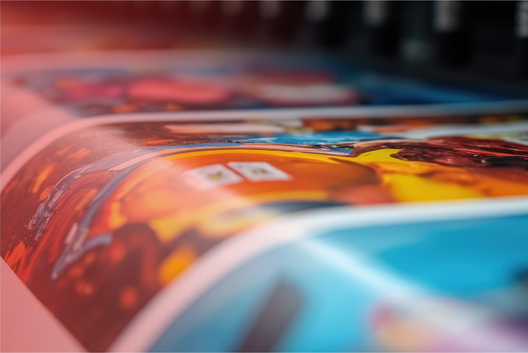
            <img
                src="https://eventual.es/wp-content/uploads/2026/08/Recurso-2@4x-100-1.jpg"
                alt="Impresión digital Comunique"
                loading="lazy"
                decoding="async"
            >

        </a>


        <a
            class="co-service-title"
            href="https://comunique.es/impresion-digital/"
        >
            Impresión digital
        </a>

    </article>


    <!-- =====================================================
         2. STANDS Y ESCENOGRAFÍA
    ====================================================== -->

    <article class="co-service">

        <a
            class="co-service-image"
            href="https://comunique.es/stands-y-escenografias/"
            aria-label="Ver Stands y escenografía"
        >

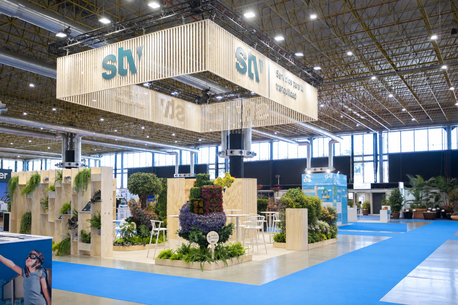
            <img
                src="https://eventual.es/wp-content/uploads/2026/09/ChatGPT-Image-18-sept-2026-11_40_42.jpg"
                alt="Stands y escenografía Comunique"
                loading="lazy"
                decoding="async"
            >

        </a>


        <a
            class="co-service-title"
            href="https://comunique.es/stands-y-escenografias/"
        >
            Stands y escenografía
        </a>

    </article>


    <!-- =====================================================
         3. RÓTULOS Y PLV
    ====================================================== -->

    <article class="co-service">

        <a
            class="co-service-image"
            href="https://comunique.es/rotulos-plv/"
            aria-label="Ver Rótulos y PLV"
        >

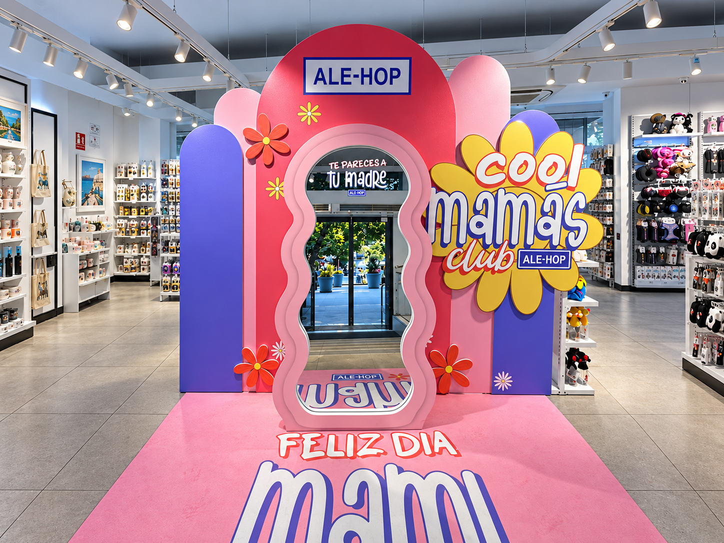
            <img
                src="https://eventual.es/wp-content/uploads/2026/09/ale-hop.png"
                alt="Rótulos y PLV Comunique"
                loading="lazy"
                decoding="async"
            >

        </a>


        <a
            class="co-service-title"
            href="https://comunique.es/rotulos-plv/"
        >
            Rótulos y PLV
        </a>

    </article>


    <!-- =====================================================
         4. FABRICACIÓN
    ====================================================== -->

    <article class="co-service">

        <a
            class="co-service-image"
            href="https://comunique.es/fabricacion/"
            aria-label="Ver Fabricación"
        >

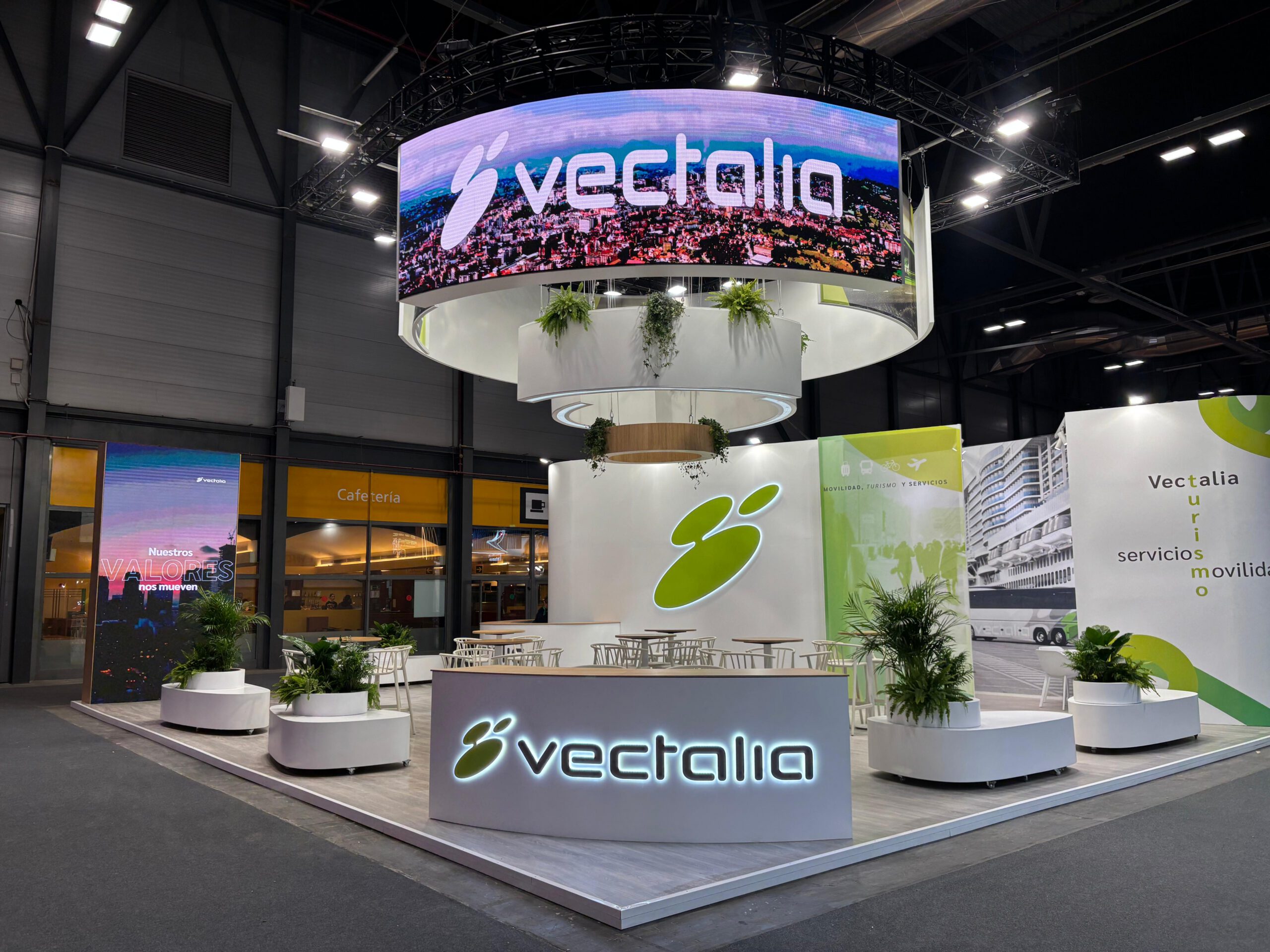
            <img
                src="https://comunique.es/wp-content/uploads/2026/08/PHOTO-2026-01-21-09-37-45-scaled.jpg"
                alt="Fabricación Comunique"
                loading="lazy"
                decoding="async"
            >

        </a>


        <a
            class="co-service-title"
            href="https://comunique.es/fabricacion/"
        >
            Fabricación
        </a>

    </article>


    <!-- =====================================================
         5. FLEXBOX
    ====================================================== -->

    <article class="co-service">

        <a
            class="co-service-image"
            href="https://comunique.es/flexbox-y-expositores/"
            aria-label="Ver Flexbox"
        >

            <img
                src="https://eventual.es/wp-content/uploads/2026/09/RR6_0118_sin_personas.jpg"
                alt="Flexbox y expositores Comunique"
                loading="lazy"
                decoding="async"
            >

        </a>


        <a
            class="co-service-title"
            href="https://comunique.es/flexbox-y-expositores/"
        >
            Flexbox
        </a>

    </article>


</div>/* End custom CSS */
/* Start custom CSS for container, class: .elementor-element-8d198ad */<style>
/* =========================================================
   COMUNIQUE — GRID DE SERVICIOS
   DESKTOP + TABLET + MÓVIL
========================================================= */

#co-servicios-grid,
#co-servicios-grid *,
#co-servicios-grid *::before,
#co-servicios-grid *::after {
    box-sizing: border-box !important;
}


/* =========================================================
   CAJA PRINCIPAL
========================================================= */

#co-servicios-grid {
    width: 100% !important;
    max-width: 1920px !important;

    margin: 0 auto !important;

    padding:
        16px
        clamp(14px, 1.6vw, 30px)
        20px !important;

    display: grid !important;

    grid-template-columns:
        repeat(5, minmax(0, 1fr)) !important;

    gap:
        clamp(16px, 1.7vw, 34px) !important;

    align-items: stretch !important;

    background: #ffffff !important;
}


/* =========================================================
   TARJETA
========================================================= */

#co-servicios-grid .co-service {
    position: relative !important;

    display: flex !important;
    flex-direction: column !important;

    min-width: 0 !important;

    margin: 0 !important;
    padding: 0 !important;

    background: #ffffff !important;

    border: 0 !important;

    overflow: hidden !important;
}


/* =========================================================
   ÁREA DE IMAGEN
========================================================= */

#co-servicios-grid .co-service-image {
    position: relative !important;

    display: block !important;

    width: 100% !important;

    aspect-ratio: 4 / 5 !important;

    overflow: hidden !important;

    background: #eeeeee !important;

    text-decoration: none !important;

    isolation: isolate !important;
}


/* =========================================================
   IMAGEN
========================================================= */

#co-servicios-grid .co-service-image img {
    position: absolute !important;

    inset: 0 !important;

    display: block !important;

    width: 100% !important;
    height: 100% !important;

    max-width: none !important;

    object-fit: cover !important;
    object-position: center center !important;

    margin: 0 !important;
    padding: 0 !important;

    border: 0 !important;

    transform: scale(1) !important;

    transition:
        transform .5s cubic-bezier(.2,.7,.2,1),
        filter .35s ease !important;
}


/* =========================================================
   OVERLAY HOVER
========================================================= */

#co-servicios-grid .co-service-image::after {
    content: "" !important;

    position: absolute !important;

    inset: 0 !important;

    z-index: 2 !important;

    display: block !important;

    background:
        rgba(0, 0, 0, 0) !important;

    transition:
        background .35s ease !important;

    pointer-events: none !important;
}


/* =========================================================
   HOVER IMAGEN
========================================================= */

@media (hover: hover) {

    #co-servicios-grid
    .co-service:hover
    .co-service-image img {

        transform:
            scale(1.055) !important;

        filter:
            brightness(.82) !important;
    }


    #co-servicios-grid
    .co-service:hover
    .co-service-image::after {

        background:
            rgba(0, 0, 0, .08) !important;
    }

}


/* =========================================================
   TÍTULO
========================================================= */

#co-servicios-grid .co-service-title {
    min-height: 88px !important;

    display: flex !important;

    align-items: center !important;
    justify-content: center !important;

    flex: 1 1 auto !important;

    width: 100% !important;

    margin: 0 !important;

    padding:
        18px
        12px !important;

    color: #050505 !important;

    background: #ffffff !important;

    font-family:
        Arial,
        Helvetica,
        sans-serif !important;

    font-size:
        clamp(20px, 1.65vw, 34px) !important;

    font-weight: 700 !important;

    line-height: 1.03 !important;

    letter-spacing:
        -0.035em !important;

    text-align: center !important;

    text-decoration: none !important;

    text-wrap: balance !important;

    transition:
        color .2s ease !important;
}


/* =========================================================
   HOVER TÍTULO
========================================================= */

#co-servicios-grid
.co-service:hover
.co-service-title {

    color: #ed1c24 !important;
}


/* =========================================================
   TABLET HORIZONTAL
========================================================= */

@media (max-width: 1200px) {

    #co-servicios-grid {

        grid-template-columns:
            repeat(3, minmax(0, 1fr)) !important;

        gap: 22px !important;

        padding:
            18px
            20px !important;
    }


    #co-servicios-grid .co-service-title {

        min-height: 78px !important;

        font-size:
            clamp(20px, 2vw, 27px) !important;
    }

}


/* =========================================================
   TABLET VERTICAL
========================================================= */

@media (max-width: 900px) {

    #co-servicios-grid {

        grid-template-columns:
            repeat(2, minmax(0, 1fr)) !important;

        gap: 20px !important;
    }


    /*
       El quinto elemento ocupa las 2 columnas
       para no quedarse raro solo a la izquierda.
    */

    #co-servicios-grid
    .co-service:last-child {

        grid-column:
            1 / -1 !important;

        width: 50% !important;

        justify-self:
            center !important;
    }


    #co-servicios-grid .co-service-title {

        min-height: 72px !important;

        padding:
            15px
            10px !important;

        font-size:
            23px !important;
    }

}


/* =========================================================
   MÓVIL
========================================================= */

@media (max-width: 767px) {

    #co-servicios-grid {

        display: grid !important;

        grid-template-columns:
            1fr !important;

        gap: 18px !important;

        padding:
            12px
            14px
            20px !important;
    }


    #co-servicios-grid
    .co-service:last-child {

        grid-column:
            auto !important;

        width: 100% !important;

        justify-self:
            stretch !important;
    }


    #co-servicios-grid .co-service-image {

        /*
           Un poco menos vertical en móvil
           para evitar una landing excesivamente larga
        */

        aspect-ratio:
            4 / 4.5 !important;
    }


    #co-servicios-grid .co-service-title {

        min-height: 64px !important;

        padding:
            14px
            10px !important;

        font-size:
            22px !important;

        line-height:
            1.05 !important;
    }

}


/* =========================================================
   MÓVIL PEQUEÑO
========================================================= */

@media (max-width: 480px) {

    #co-servicios-grid {

        gap: 15px !important;

        padding:
            10px
            11px
            18px !important;
    }


    #co-servicios-grid .co-service-title {

        min-height: 60px !important;

        font-size:
            20px !important;

        padding:
            12px
            8px !important;
    }

}


/* =========================================================
   ACCESIBILIDAD
========================================================= */

#co-servicios-grid a:focus-visible {

    outline:
        3px solid #ed1c24 !important;

    outline-offset:
        -3px !important;
}
</style>


<div id="co-servicios-grid">


    <!-- =====================================================
         1. IMPRESIÓN DIGITAL
    ====================================================== -->

    <article class="co-service">

        <a
            class="co-service-image"
            href="https://comunique.es/impresion-digital/"
            aria-label="Ver Impresión digital"
        >

            <img
                src="https://eventual.es/wp-content/uploads/2026/08/Recurso-2@4x-100-1.jpg"
                alt="Impresión digital Comunique"
                loading="lazy"
                decoding="async"
            >

        </a>


        <a
            class="co-service-title"
            href="https://comunique.es/impresion-digital/"
        >
            Impresión digital
        </a>

    </article>


    <!-- =====================================================
         2. STANDS Y ESCENOGRAFÍA
    ====================================================== -->

    <article class="co-service">

        <a
            class="co-service-image"
            href="https://comunique.es/stands-y-escenografias/"
            aria-label="Ver Stands y escenografía"
        >

            <img
                src="https://eventual.es/wp-content/uploads/2026/09/ChatGPT-Image-18-sept-2026-11_40_42.jpg"
                alt="Stands y escenografía Comunique"
                loading="lazy"
                decoding="async"
            >

        </a>


        <a
            class="co-service-title"
            href="https://comunique.es/stands-y-escenografias/"
        >
            Stands y escenografía
        </a>

    </article>


    <!-- =====================================================
         3. RÓTULOS Y PLV
    ====================================================== -->

    <article class="co-service">

        <a
            class="co-service-image"
            href="https://comunique.es/rotulos-plv/"
            aria-label="Ver Rótulos y PLV"
        >

            <img
                src="https://eventual.es/wp-content/uploads/2026/09/ale-hop.png"
                alt="Rótulos y PLV Comunique"
                loading="lazy"
                decoding="async"
            >

        </a>


        <a
            class="co-service-title"
            href="https://comunique.es/rotulos-plv/"
        >
            Rótulos y PLV
        </a>

    </article>


    <!-- =====================================================
         4. FABRICACIÓN
    ====================================================== -->

    <article class="co-service">

        <a
            class="co-service-image"
            href="https://comunique.es/fabricacion/"
            aria-label="Ver Fabricación"
        >

            <img
                src="https://comunique.es/wp-content/uploads/2026/08/PHOTO-2026-01-21-09-37-45-scaled.jpg"
                alt="Fabricación Comunique"
                loading="lazy"
                decoding="async"
            >

        </a>


        <a
            class="co-service-title"
            href="https://comunique.es/fabricacion/"
        >
            Fabricación
        </a>

    </article>


    <!-- =====================================================
         5. FLEXBOX
    ====================================================== -->

    <article class="co-service">

        <a
            class="co-service-image"
            href="https://comunique.es/flexbox-y-expositores/"
            aria-label="Ver Flexbox"
        >

            <img
                src="https://eventual.es/wp-content/uploads/2026/09/RR6_0118_sin_personas.jpg"
                alt="Flexbox y expositores Comunique"
                loading="lazy"
                decoding="async"
            >

        </a>


        <a
            class="co-service-title"
            href="https://comunique.es/flexbox-y-expositores/"
        >
            Flexbox
        </a>

    </article>


</div>/* End custom CSS */
/* Start custom CSS for container, class: .elementor-element-2f98f10 */<style>
/* =========================================================
   COMUNIQUE — GRID DE SERVICIOS
   DESKTOP + TABLET + MÓVIL
========================================================= */

#co-servicios-grid,
#co-servicios-grid *,
#co-servicios-grid *::before,
#co-servicios-grid *::after {
    box-sizing: border-box !important;
}


/* =========================================================
   CAJA PRINCIPAL
========================================================= */

#co-servicios-grid {
    width: 100% !important;
    max-width: 1920px !important;

    margin: 0 auto !important;

    padding:
        16px
        clamp(14px, 1.6vw, 30px)
        20px !important;

    display: grid !important;

    grid-template-columns:
        repeat(5, minmax(0, 1fr)) !important;

    gap:
        clamp(16px, 1.7vw, 34px) !important;

    align-items: stretch !important;

    background: #ffffff !important;
}


/* =========================================================
   TARJETA
========================================================= */

#co-servicios-grid .co-service {
    position: relative !important;

    display: flex !important;
    flex-direction: column !important;

    min-width: 0 !important;

    margin: 0 !important;
    padding: 0 !important;

    background: #ffffff !important;

    border: 0 !important;

    overflow: hidden !important;
}


/* =========================================================
   ÁREA DE IMAGEN
========================================================= */

#co-servicios-grid .co-service-image {
    position: relative !important;

    display: block !important;

    width: 100% !important;

    aspect-ratio: 4 / 5 !important;

    overflow: hidden !important;

    background: #eeeeee !important;

    text-decoration: none !important;

    isolation: isolate !important;
}


/* =========================================================
   IMAGEN
========================================================= */

#co-servicios-grid .co-service-image img {
    position: absolute !important;

    inset: 0 !important;

    display: block !important;

    width: 100% !important;
    height: 100% !important;

    max-width: none !important;

    object-fit: cover !important;
    object-position: center center !important;

    margin: 0 !important;
    padding: 0 !important;

    border: 0 !important;

    transform: scale(1) !important;

    transition:
        transform .5s cubic-bezier(.2,.7,.2,1),
        filter .35s ease !important;
}


/* =========================================================
   OVERLAY HOVER
========================================================= */

#co-servicios-grid .co-service-image::after {
    content: "" !important;

    position: absolute !important;

    inset: 0 !important;

    z-index: 2 !important;

    display: block !important;

    background:
        rgba(0, 0, 0, 0) !important;

    transition:
        background .35s ease !important;

    pointer-events: none !important;
}


/* =========================================================
   HOVER IMAGEN
========================================================= */

@media (hover: hover) {

    #co-servicios-grid
    .co-service:hover
    .co-service-image img {

        transform:
            scale(1.055) !important;

        filter:
            brightness(.82) !important;
    }


    #co-servicios-grid
    .co-service:hover
    .co-service-image::after {

        background:
            rgba(0, 0, 0, .08) !important;
    }

}


/* =========================================================
   TÍTULO
========================================================= */

#co-servicios-grid .co-service-title {
    min-height: 88px !important;

    display: flex !important;

    align-items: center !important;
    justify-content: center !important;

    flex: 1 1 auto !important;

    width: 100% !important;

    margin: 0 !important;

    padding:
        18px
        12px !important;

    color: #050505 !important;

    background: #ffffff !important;

    font-family:
        Arial,
        Helvetica,
        sans-serif !important;

    font-size:
        clamp(20px, 1.65vw, 34px) !important;

    font-weight: 700 !important;

    line-height: 1.03 !important;

    letter-spacing:
        -0.035em !important;

    text-align: center !important;

    text-decoration: none !important;

    text-wrap: balance !important;

    transition:
        color .2s ease !important;
}


/* =========================================================
   HOVER TÍTULO
========================================================= */

#co-servicios-grid
.co-service:hover
.co-service-title {

    color: #ed1c24 !important;
}


/* =========================================================
   TABLET HORIZONTAL
========================================================= */

@media (max-width: 1200px) {

    #co-servicios-grid {

        grid-template-columns:
            repeat(3, minmax(0, 1fr)) !important;

        gap: 22px !important;

        padding:
            18px
            20px !important;
    }


    #co-servicios-grid .co-service-title {

        min-height: 78px !important;

        font-size:
            clamp(20px, 2vw, 27px) !important;
    }

}


/* =========================================================
   TABLET VERTICAL
========================================================= */

@media (max-width: 900px) {

    #co-servicios-grid {

        grid-template-columns:
            repeat(2, minmax(0, 1fr)) !important;

        gap: 20px !important;
    }


    /*
       El quinto elemento ocupa las 2 columnas
       para no quedarse raro solo a la izquierda.
    */

    #co-servicios-grid
    .co-service:last-child {

        grid-column:
            1 / -1 !important;

        width: 50% !important;

        justify-self:
            center !important;
    }


    #co-servicios-grid .co-service-title {

        min-height: 72px !important;

        padding:
            15px
            10px !important;

        font-size:
            23px !important;
    }

}


/* =========================================================
   MÓVIL
========================================================= */

@media (max-width: 767px) {

    #co-servicios-grid {

        display: grid !important;

        grid-template-columns:
            1fr !important;

        gap: 18px !important;

        padding:
            12px
            14px
            20px !important;
    }


    #co-servicios-grid
    .co-service:last-child {

        grid-column:
            auto !important;

        width: 100% !important;

        justify-self:
            stretch !important;
    }


    #co-servicios-grid .co-service-image {

        /*
           Un poco menos vertical en móvil
           para evitar una landing excesivamente larga
        */

        aspect-ratio:
            4 / 4.5 !important;
    }


    #co-servicios-grid .co-service-title {

        min-height: 64px !important;

        padding:
            14px
            10px !important;

        font-size:
            22px !important;

        line-height:
            1.05 !important;
    }

}


/* =========================================================
   MÓVIL PEQUEÑO
========================================================= */

@media (max-width: 480px) {

    #co-servicios-grid {

        gap: 15px !important;

        padding:
            10px
            11px
            18px !important;
    }


    #co-servicios-grid .co-service-title {

        min-height: 60px !important;

        font-size:
            20px !important;

        padding:
            12px
            8px !important;
    }

}


/* =========================================================
   ACCESIBILIDAD
========================================================= */

#co-servicios-grid a:focus-visible {

    outline:
        3px solid #ed1c24 !important;

    outline-offset:
        -3px !important;
}
</style>


<div id="co-servicios-grid">


    <!-- =====================================================
         1. IMPRESIÓN DIGITAL
    ====================================================== -->

    <article class="co-service">

        <a
            class="co-service-image"
            href="https://comunique.es/impresion-digital/"
            aria-label="Ver Impresión digital"
        >

            <img
                src="https://eventual.es/wp-content/uploads/2026/08/Recurso-2@4x-100-1.jpg"
                alt="Impresión digital Comunique"
                loading="lazy"
                decoding="async"
            >

        </a>


        <a
            class="co-service-title"
            href="https://comunique.es/impresion-digital/"
        >
            Impresión digital
        </a>

    </article>


    <!-- =====================================================
         2. STANDS Y ESCENOGRAFÍA
    ====================================================== -->

    <article class="co-service">

        <a
            class="co-service-image"
            href="https://comunique.es/stands-y-escenografias/"
            aria-label="Ver Stands y escenografía"
        >

            <img
                src="https://eventual.es/wp-content/uploads/2026/09/ChatGPT-Image-18-sept-2026-11_40_42.jpg"
                alt="Stands y escenografía Comunique"
                loading="lazy"
                decoding="async"
            >

        </a>


        <a
            class="co-service-title"
            href="https://comunique.es/stands-y-escenografias/"
        >
            Stands y escenografía
        </a>

    </article>


    <!-- =====================================================
         3. RÓTULOS Y PLV
    ====================================================== -->

    <article class="co-service">

        <a
            class="co-service-image"
            href="https://comunique.es/rotulos-plv/"
            aria-label="Ver Rótulos y PLV"
        >

            <img
                src="https://eventual.es/wp-content/uploads/2026/09/ale-hop.png"
                alt="Rótulos y PLV Comunique"
                loading="lazy"
                decoding="async"
            >

        </a>


        <a
            class="co-service-title"
            href="https://comunique.es/rotulos-plv/"
        >
            Rótulos y PLV
        </a>

    </article>


    <!-- =====================================================
         4. FABRICACIÓN
    ====================================================== -->

    <article class="co-service">

        <a
            class="co-service-image"
            href="https://comunique.es/fabricacion/"
            aria-label="Ver Fabricación"
        >

            <img
                src="https://comunique.es/wp-content/uploads/2026/08/PHOTO-2026-01-21-09-37-45-scaled.jpg"
                alt="Fabricación Comunique"
                loading="lazy"
                decoding="async"
            >

        </a>


        <a
            class="co-service-title"
            href="https://comunique.es/fabricacion/"
        >
            Fabricación
        </a>

    </article>


    <!-- =====================================================
         5. FLEXBOX
    ====================================================== -->

    <article class="co-service">

        <a
            class="co-service-image"
            href="https://comunique.es/flexbox-y-expositores/"
            aria-label="Ver Flexbox"
        >

            <img
                src="https://eventual.es/wp-content/uploads/2026/09/RR6_0118_sin_personas.jpg"
                alt="Flexbox y expositores Comunique"
                loading="lazy"
                decoding="async"
            >

        </a>


        <a
            class="co-service-title"
            href="https://comunique.es/flexbox-y-expositores/"
        >
            Flexbox
        </a>

    </article>


</div>/* End custom CSS */
/* Start custom CSS for container, class: .elementor-element-b011efb */<style>
/* =========================================================
   COMUNIQUE — GRID DE SERVICIOS
   DESKTOP + TABLET + MÓVIL
========================================================= */

#co-servicios-grid,
#co-servicios-grid *,
#co-servicios-grid *::before,
#co-servicios-grid *::after {
    box-sizing: border-box !important;
}


/* =========================================================
   CAJA PRINCIPAL
========================================================= */

#co-servicios-grid {
    width: 100% !important;
    max-width: 1920px !important;

    margin: 0 auto !important;

    padding:
        16px
        clamp(14px, 1.6vw, 30px)
        20px !important;

    display: grid !important;

    grid-template-columns:
        repeat(5, minmax(0, 1fr)) !important;

    gap:
        clamp(16px, 1.7vw, 34px) !important;

    align-items: stretch !important;

    background: #ffffff !important;
}


/* =========================================================
   TARJETA
========================================================= */

#co-servicios-grid .co-service {
    position: relative !important;

    display: flex !important;
    flex-direction: column !important;

    min-width: 0 !important;

    margin: 0 !important;
    padding: 0 !important;

    background: #ffffff !important;

    border: 0 !important;

    overflow: hidden !important;
}


/* =========================================================
   ÁREA DE IMAGEN
========================================================= */

#co-servicios-grid .co-service-image {
    position: relative !important;

    display: block !important;

    width: 100% !important;

    aspect-ratio: 4 / 5 !important;

    overflow: hidden !important;

    background: #eeeeee !important;

    text-decoration: none !important;

    isolation: isolate !important;
}


/* =========================================================
   IMAGEN
========================================================= */

#co-servicios-grid .co-service-image img {
    position: absolute !important;

    inset: 0 !important;

    display: block !important;

    width: 100% !important;
    height: 100% !important;

    max-width: none !important;

    object-fit: cover !important;
    object-position: center center !important;

    margin: 0 !important;
    padding: 0 !important;

    border: 0 !important;

    transform: scale(1) !important;

    transition:
        transform .5s cubic-bezier(.2,.7,.2,1),
        filter .35s ease !important;
}


/* =========================================================
   OVERLAY HOVER
========================================================= */

#co-servicios-grid .co-service-image::after {
    content: "" !important;

    position: absolute !important;

    inset: 0 !important;

    z-index: 2 !important;

    display: block !important;

    background:
        rgba(0, 0, 0, 0) !important;

    transition:
        background .35s ease !important;

    pointer-events: none !important;
}


/* =========================================================
   HOVER IMAGEN
========================================================= */

@media (hover: hover) {

    #co-servicios-grid
    .co-service:hover
    .co-service-image img {

        transform:
            scale(1.055) !important;

        filter:
            brightness(.82) !important;
    }


    #co-servicios-grid
    .co-service:hover
    .co-service-image::after {

        background:
            rgba(0, 0, 0, .08) !important;
    }

}


/* =========================================================
   TÍTULO
========================================================= */

#co-servicios-grid .co-service-title {
    min-height: 88px !important;

    display: flex !important;

    align-items: center !important;
    justify-content: center !important;

    flex: 1 1 auto !important;

    width: 100% !important;

    margin: 0 !important;

    padding:
        18px
        12px !important;

    color: #050505 !important;

    background: #ffffff !important;

    font-family:
        Arial,
        Helvetica,
        sans-serif !important;

    font-size:
        clamp(20px, 1.65vw, 34px) !important;

    font-weight: 700 !important;

    line-height: 1.03 !important;

    letter-spacing:
        -0.035em !important;

    text-align: center !important;

    text-decoration: none !important;

    text-wrap: balance !important;

    transition:
        color .2s ease !important;
}


/* =========================================================
   HOVER TÍTULO
========================================================= */

#co-servicios-grid
.co-service:hover
.co-service-title {

    color: #ed1c24 !important;
}


/* =========================================================
   TABLET HORIZONTAL
========================================================= */

@media (max-width: 1200px) {

    #co-servicios-grid {

        grid-template-columns:
            repeat(3, minmax(0, 1fr)) !important;

        gap: 22px !important;

        padding:
            18px
            20px !important;
    }


    #co-servicios-grid .co-service-title {

        min-height: 78px !important;

        font-size:
            clamp(20px, 2vw, 27px) !important;
    }

}


/* =========================================================
   TABLET VERTICAL
========================================================= */

@media (max-width: 900px) {

    #co-servicios-grid {

        grid-template-columns:
            repeat(2, minmax(0, 1fr)) !important;

        gap: 20px !important;
    }


    /*
       El quinto elemento ocupa las 2 columnas
       para no quedarse raro solo a la izquierda.
    */

    #co-servicios-grid
    .co-service:last-child {

        grid-column:
            1 / -1 !important;

        width: 50% !important;

        justify-self:
            center !important;
    }


    #co-servicios-grid .co-service-title {

        min-height: 72px !important;

        padding:
            15px
            10px !important;

        font-size:
            23px !important;
    }

}


/* =========================================================
   MÓVIL
========================================================= */

@media (max-width: 767px) {

    #co-servicios-grid {

        display: grid !important;

        grid-template-columns:
            1fr !important;

        gap: 18px !important;

        padding:
            12px
            14px
            20px !important;
    }


    #co-servicios-grid
    .co-service:last-child {

        grid-column:
            auto !important;

        width: 100% !important;

        justify-self:
            stretch !important;
    }


    #co-servicios-grid .co-service-image {

        /*
           Un poco menos vertical en móvil
           para evitar una landing excesivamente larga
        */

        aspect-ratio:
            4 / 4.5 !important;
    }


    #co-servicios-grid .co-service-title {

        min-height: 64px !important;

        padding:
            14px
            10px !important;

        font-size:
            22px !important;

        line-height:
            1.05 !important;
    }

}


/* =========================================================
   MÓVIL PEQUEÑO
========================================================= */

@media (max-width: 480px) {

    #co-servicios-grid {

        gap: 15px !important;

        padding:
            10px
            11px
            18px !important;
    }


    #co-servicios-grid .co-service-title {

        min-height: 60px !important;

        font-size:
            20px !important;

        padding:
            12px
            8px !important;
    }

}


/* =========================================================
   ACCESIBILIDAD
========================================================= */

#co-servicios-grid a:focus-visible {

    outline:
        3px solid #ed1c24 !important;

    outline-offset:
        -3px !important;
}
</style>


<div id="co-servicios-grid">


    <!-- =====================================================
         1. IMPRESIÓN DIGITAL
    ====================================================== -->

    <article class="co-service">

        <a
            class="co-service-image"
            href="https://comunique.es/impresion-digital/"
            aria-label="Ver Impresión digital"
        >

            <img
                src="https://eventual.es/wp-content/uploads/2026/08/Recurso-2@4x-100-1.jpg"
                alt="Impresión digital Comunique"
                loading="lazy"
                decoding="async"
            >

        </a>


        <a
            class="co-service-title"
            href="https://comunique.es/impresion-digital/"
        >
            Impresión digital
        </a>

    </article>


    <!-- =====================================================
         2. STANDS Y ESCENOGRAFÍA
    ====================================================== -->

    <article class="co-service">

        <a
            class="co-service-image"
            href="https://comunique.es/stands-y-escenografias/"
            aria-label="Ver Stands y escenografía"
        >

            <img
                src="https://eventual.es/wp-content/uploads/2026/09/ChatGPT-Image-18-sept-2026-11_40_42.jpg"
                alt="Stands y escenografía Comunique"
                loading="lazy"
                decoding="async"
            >

        </a>


        <a
            class="co-service-title"
            href="https://comunique.es/stands-y-escenografias/"
        >
            Stands y escenografía
        </a>

    </article>


    <!-- =====================================================
         3. RÓTULOS Y PLV
    ====================================================== -->

    <article class="co-service">

        <a
            class="co-service-image"
            href="https://comunique.es/rotulos-plv/"
            aria-label="Ver Rótulos y PLV"
        >

            <img
                src="https://eventual.es/wp-content/uploads/2026/09/ale-hop.png"
                alt="Rótulos y PLV Comunique"
                loading="lazy"
                decoding="async"
            >

        </a>


        <a
            class="co-service-title"
            href="https://comunique.es/rotulos-plv/"
        >
            Rótulos y PLV
        </a>

    </article>


    <!-- =====================================================
         4. FABRICACIÓN
    ====================================================== -->

    <article class="co-service">

        <a
            class="co-service-image"
            href="https://comunique.es/fabricacion/"
            aria-label="Ver Fabricación"
        >

            <img
                src="https://comunique.es/wp-content/uploads/2026/08/PHOTO-2026-01-21-09-37-45-scaled.jpg"
                alt="Fabricación Comunique"
                loading="lazy"
                decoding="async"
            >

        </a>


        <a
            class="co-service-title"
            href="https://comunique.es/fabricacion/"
        >
            Fabricación
        </a>

    </article>


    <!-- =====================================================
         5. FLEXBOX
    ====================================================== -->

    <article class="co-service">

        <a
            class="co-service-image"
            href="https://comunique.es/flexbox-y-expositores/"
            aria-label="Ver Flexbox"
        >

            <img
                src="https://eventual.es/wp-content/uploads/2026/09/RR6_0118_sin_personas.jpg"
                alt="Flexbox y expositores Comunique"
                loading="lazy"
                decoding="async"
            >

        </a>


        <a
            class="co-service-title"
            href="https://comunique.es/flexbox-y-expositores/"
        >
            Flexbox
        </a>

    </article>


</div>/* End custom CSS */
/* Start custom CSS for container, class: .elementor-element-3ebdd99 */<style>
/* =========================================================
   COMUNIQUE — GRID DE SERVICIOS
   DESKTOP + TABLET + MÓVIL
========================================================= */

#co-servicios-grid,
#co-servicios-grid *,
#co-servicios-grid *::before,
#co-servicios-grid *::after {
    box-sizing: border-box !important;
}


/* =========================================================
   CAJA PRINCIPAL
========================================================= */

#co-servicios-grid {
    width: 100% !important;
    max-width: 1920px !important;

    margin: 0 auto !important;

    padding:
        16px
        clamp(14px, 1.6vw, 30px)
        20px !important;

    display: grid !important;

    grid-template-columns:
        repeat(5, minmax(0, 1fr)) !important;

    gap:
        clamp(16px, 1.7vw, 34px) !important;

    align-items: stretch !important;

    background: #ffffff !important;
}


/* =========================================================
   TARJETA
========================================================= */

#co-servicios-grid .co-service {
    position: relative !important;

    display: flex !important;
    flex-direction: column !important;

    min-width: 0 !important;

    margin: 0 !important;
    padding: 0 !important;

    background: #ffffff !important;

    border: 0 !important;

    overflow: hidden !important;
}


/* =========================================================
   ÁREA DE IMAGEN
========================================================= */

#co-servicios-grid .co-service-image {
    position: relative !important;

    display: block !important;

    width: 100% !important;

    aspect-ratio: 4 / 5 !important;

    overflow: hidden !important;

    background: #eeeeee !important;

    text-decoration: none !important;

    isolation: isolate !important;
}


/* =========================================================
   IMAGEN
========================================================= */

#co-servicios-grid .co-service-image img {
    position: absolute !important;

    inset: 0 !important;

    display: block !important;

    width: 100% !important;
    height: 100% !important;

    max-width: none !important;

    object-fit: cover !important;
    object-position: center center !important;

    margin: 0 !important;
    padding: 0 !important;

    border: 0 !important;

    transform: scale(1) !important;

    transition:
        transform .5s cubic-bezier(.2,.7,.2,1),
        filter .35s ease !important;
}


/* =========================================================
   OVERLAY HOVER
========================================================= */

#co-servicios-grid .co-service-image::after {
    content: "" !important;

    position: absolute !important;

    inset: 0 !important;

    z-index: 2 !important;

    display: block !important;

    background:
        rgba(0, 0, 0, 0) !important;

    transition:
        background .35s ease !important;

    pointer-events: none !important;
}


/* =========================================================
   HOVER IMAGEN
========================================================= */

@media (hover: hover) {

    #co-servicios-grid
    .co-service:hover
    .co-service-image img {

        transform:
            scale(1.055) !important;

        filter:
            brightness(.82) !important;
    }


    #co-servicios-grid
    .co-service:hover
    .co-service-image::after {

        background:
            rgba(0, 0, 0, .08) !important;
    }

}


/* =========================================================
   TÍTULO
========================================================= */

#co-servicios-grid .co-service-title {
    min-height: 88px !important;

    display: flex !important;

    align-items: center !important;
    justify-content: center !important;

    flex: 1 1 auto !important;

    width: 100% !important;

    margin: 0 !important;

    padding:
        18px
        12px !important;

    color: #050505 !important;

    background: #ffffff !important;

    font-family:
        Arial,
        Helvetica,
        sans-serif !important;

    font-size:
        clamp(20px, 1.65vw, 34px) !important;

    font-weight: 700 !important;

    line-height: 1.03 !important;

    letter-spacing:
        -0.035em !important;

    text-align: center !important;

    text-decoration: none !important;

    text-wrap: balance !important;

    transition:
        color .2s ease !important;
}


/* =========================================================
   HOVER TÍTULO
========================================================= */

#co-servicios-grid
.co-service:hover
.co-service-title {

    color: #ed1c24 !important;
}


/* =========================================================
   TABLET HORIZONTAL
========================================================= */

@media (max-width: 1200px) {

    #co-servicios-grid {

        grid-template-columns:
            repeat(3, minmax(0, 1fr)) !important;

        gap: 22px !important;

        padding:
            18px
            20px !important;
    }


    #co-servicios-grid .co-service-title {

        min-height: 78px !important;

        font-size:
            clamp(20px, 2vw, 27px) !important;
    }

}


/* =========================================================
   TABLET VERTICAL
========================================================= */

@media (max-width: 900px) {

    #co-servicios-grid {

        grid-template-columns:
            repeat(2, minmax(0, 1fr)) !important;

        gap: 20px !important;
    }


    /*
       El quinto elemento ocupa las 2 columnas
       para no quedarse raro solo a la izquierda.
    */

    #co-servicios-grid
    .co-service:last-child {

        grid-column:
            1 / -1 !important;

        width: 50% !important;

        justify-self:
            center !important;
    }


    #co-servicios-grid .co-service-title {

        min-height: 72px !important;

        padding:
            15px
            10px !important;

        font-size:
            23px !important;
    }

}


/* =========================================================
   MÓVIL
========================================================= */

@media (max-width: 767px) {

    #co-servicios-grid {

        display: grid !important;

        grid-template-columns:
            1fr !important;

        gap: 18px !important;

        padding:
            12px
            14px
            20px !important;
    }


    #co-servicios-grid
    .co-service:last-child {

        grid-column:
            auto !important;

        width: 100% !important;

        justify-self:
            stretch !important;
    }


    #co-servicios-grid .co-service-image {

        /*
           Un poco menos vertical en móvil
           para evitar una landing excesivamente larga
        */

        aspect-ratio:
            4 / 4.5 !important;
    }


    #co-servicios-grid .co-service-title {

        min-height: 64px !important;

        padding:
            14px
            10px !important;

        font-size:
            22px !important;

        line-height:
            1.05 !important;
    }

}


/* =========================================================
   MÓVIL PEQUEÑO
========================================================= */

@media (max-width: 480px) {

    #co-servicios-grid {

        gap: 15px !important;

        padding:
            10px
            11px
            18px !important;
    }


    #co-servicios-grid .co-service-title {

        min-height: 60px !important;

        font-size:
            20px !important;

        padding:
            12px
            8px !important;
    }

}


/* =========================================================
   ACCESIBILIDAD
========================================================= */

#co-servicios-grid a:focus-visible {

    outline:
        3px solid #ed1c24 !important;

    outline-offset:
        -3px !important;
}
</style>


<div id="co-servicios-grid">


    <!-- =====================================================
         1. IMPRESIÓN DIGITAL
    ====================================================== -->

    <article class="co-service">

        <a
            class="co-service-image"
            href="https://comunique.es/impresion-digital/"
            aria-label="Ver Impresión digital"
        >

            <img
                src="https://eventual.es/wp-content/uploads/2026/08/Recurso-2@4x-100-1.jpg"
                alt="Impresión digital Comunique"
                loading="lazy"
                decoding="async"
            >

        </a>


        <a
            class="co-service-title"
            href="https://comunique.es/impresion-digital/"
        >
            Impresión digital
        </a>

    </article>


    <!-- =====================================================
         2. STANDS Y ESCENOGRAFÍA
    ====================================================== -->

    <article class="co-service">

        <a
            class="co-service-image"
            href="https://comunique.es/stands-y-escenografias/"
            aria-label="Ver Stands y escenografía"
        >

            <img
                src="https://eventual.es/wp-content/uploads/2026/09/ChatGPT-Image-18-sept-2026-11_40_42.jpg"
                alt="Stands y escenografía Comunique"
                loading="lazy"
                decoding="async"
            >

        </a>


        <a
            class="co-service-title"
            href="https://comunique.es/stands-y-escenografias/"
        >
            Stands y escenografía
        </a>

    </article>


    <!-- =====================================================
         3. RÓTULOS Y PLV
    ====================================================== -->

    <article class="co-service">

        <a
            class="co-service-image"
            href="https://comunique.es/rotulos-plv/"
            aria-label="Ver Rótulos y PLV"
        >

            <img
                src="https://eventual.es/wp-content/uploads/2026/09/ale-hop.png"
                alt="Rótulos y PLV Comunique"
                loading="lazy"
                decoding="async"
            >

        </a>


        <a
            class="co-service-title"
            href="https://comunique.es/rotulos-plv/"
        >
            Rótulos y PLV
        </a>

    </article>


    <!-- =====================================================
         4. FABRICACIÓN
    ====================================================== -->

    <article class="co-service">

        <a
            class="co-service-image"
            href="https://comunique.es/fabricacion/"
            aria-label="Ver Fabricación"
        >

            <img
                src="https://comunique.es/wp-content/uploads/2026/08/PHOTO-2026-01-21-09-37-45-scaled.jpg"
                alt="Fabricación Comunique"
                loading="lazy"
                decoding="async"
            >

        </a>


        <a
            class="co-service-title"
            href="https://comunique.es/fabricacion/"
        >
            Fabricación
        </a>

    </article>


    <!-- =====================================================
         5. FLEXBOX
    ====================================================== -->

    <article class="co-service">

        <a
            class="co-service-image"
            href="https://comunique.es/flexbox-y-expositores/"
            aria-label="Ver Flexbox"
        >

            <img
                src="https://eventual.es/wp-content/uploads/2026/09/RR6_0118_sin_personas.jpg"
                alt="Flexbox y expositores Comunique"
                loading="lazy"
                decoding="async"
            >

        </a>


        <a
            class="co-service-title"
            href="https://comunique.es/flexbox-y-expositores/"
        >
            Flexbox
        </a>

    </article>


</div>/* End custom CSS */
/* Start custom CSS for container, class: .elementor-element-164dc58 */<style>
/* =========================================================
   COMUNIQUE — GRID DE SERVICIOS
   DESKTOP + TABLET + MÓVIL
========================================================= */

#co-servicios-grid,
#co-servicios-grid *,
#co-servicios-grid *::before,
#co-servicios-grid *::after {
    box-sizing: border-box !important;
}


/* =========================================================
   CAJA PRINCIPAL
========================================================= */

#co-servicios-grid {
    width: 100% !important;
    max-width: 1920px !important;

    margin: 0 auto !important;

    padding:
        16px
        clamp(14px, 1.6vw, 30px)
        20px !important;

    display: grid !important;

    grid-template-columns:
        repeat(5, minmax(0, 1fr)) !important;

    gap:
        clamp(16px, 1.7vw, 34px) !important;

    align-items: stretch !important;

    background: #ffffff !important;
}


/* =========================================================
   TARJETA
========================================================= */

#co-servicios-grid .co-service {
    position: relative !important;

    display: flex !important;
    flex-direction: column !important;

    min-width: 0 !important;

    margin: 0 !important;
    padding: 0 !important;

    background: #ffffff !important;

    border: 0 !important;

    overflow: hidden !important;
}


/* =========================================================
   ÁREA DE IMAGEN
========================================================= */

#co-servicios-grid .co-service-image {
    position: relative !important;

    display: block !important;

    width: 100% !important;

    aspect-ratio: 4 / 5 !important;

    overflow: hidden !important;

    background: #eeeeee !important;

    text-decoration: none !important;

    isolation: isolate !important;
}


/* =========================================================
   IMAGEN
========================================================= */

#co-servicios-grid .co-service-image img {
    position: absolute !important;

    inset: 0 !important;

    display: block !important;

    width: 100% !important;
    height: 100% !important;

    max-width: none !important;

    object-fit: cover !important;
    object-position: center center !important;

    margin: 0 !important;
    padding: 0 !important;

    border: 0 !important;

    transform: scale(1) !important;

    transition:
        transform .5s cubic-bezier(.2,.7,.2,1),
        filter .35s ease !important;
}


/* =========================================================
   OVERLAY HOVER
========================================================= */

#co-servicios-grid .co-service-image::after {
    content: "" !important;

    position: absolute !important;

    inset: 0 !important;

    z-index: 2 !important;

    display: block !important;

    background:
        rgba(0, 0, 0, 0) !important;

    transition:
        background .35s ease !important;

    pointer-events: none !important;
}


/* =========================================================
   HOVER IMAGEN
========================================================= */

@media (hover: hover) {

    #co-servicios-grid
    .co-service:hover
    .co-service-image img {

        transform:
            scale(1.055) !important;

        filter:
            brightness(.82) !important;
    }


    #co-servicios-grid
    .co-service:hover
    .co-service-image::after {

        background:
            rgba(0, 0, 0, .08) !important;
    }

}


/* =========================================================
   TÍTULO
========================================================= */

#co-servicios-grid .co-service-title {
    min-height: 88px !important;

    display: flex !important;

    align-items: center !important;
    justify-content: center !important;

    flex: 1 1 auto !important;

    width: 100% !important;

    margin: 0 !important;

    padding:
        18px
        12px !important;

    color: #050505 !important;

    background: #ffffff !important;

    font-family:
        Arial,
        Helvetica,
        sans-serif !important;

    font-size:
        clamp(20px, 1.65vw, 34px) !important;

    font-weight: 700 !important;

    line-height: 1.03 !important;

    letter-spacing:
        -0.035em !important;

    text-align: center !important;

    text-decoration: none !important;

    text-wrap: balance !important;

    transition:
        color .2s ease !important;
}


/* =========================================================
   HOVER TÍTULO
========================================================= */

#co-servicios-grid
.co-service:hover
.co-service-title {

    color: #ed1c24 !important;
}


/* =========================================================
   TABLET HORIZONTAL
========================================================= */

@media (max-width: 1200px) {

    #co-servicios-grid {

        grid-template-columns:
            repeat(3, minmax(0, 1fr)) !important;

        gap: 22px !important;

        padding:
            18px
            20px !important;
    }


    #co-servicios-grid .co-service-title {

        min-height: 78px !important;

        font-size:
            clamp(20px, 2vw, 27px) !important;
    }

}


/* =========================================================
   TABLET VERTICAL
========================================================= */

@media (max-width: 900px) {

    #co-servicios-grid {

        grid-template-columns:
            repeat(2, minmax(0, 1fr)) !important;

        gap: 20px !important;
    }


    /*
       El quinto elemento ocupa las 2 columnas
       para no quedarse raro solo a la izquierda.
    */

    #co-servicios-grid
    .co-service:last-child {

        grid-column:
            1 / -1 !important;

        width: 50% !important;

        justify-self:
            center !important;
    }


    #co-servicios-grid .co-service-title {

        min-height: 72px !important;

        padding:
            15px
            10px !important;

        font-size:
            23px !important;
    }

}


/* =========================================================
   MÓVIL
========================================================= */

@media (max-width: 767px) {

    #co-servicios-grid {

        display: grid !important;

        grid-template-columns:
            1fr !important;

        gap: 18px !important;

        padding:
            12px
            14px
            20px !important;
    }


    #co-servicios-grid
    .co-service:last-child {

        grid-column:
            auto !important;

        width: 100% !important;

        justify-self:
            stretch !important;
    }


    #co-servicios-grid .co-service-image {

        /*
           Un poco menos vertical en móvil
           para evitar una landing excesivamente larga
        */

        aspect-ratio:
            4 / 4.5 !important;
    }


    #co-servicios-grid .co-service-title {

        min-height: 64px !important;

        padding:
            14px
            10px !important;

        font-size:
            22px !important;

        line-height:
            1.05 !important;
    }

}


/* =========================================================
   MÓVIL PEQUEÑO
========================================================= */

@media (max-width: 480px) {

    #co-servicios-grid {

        gap: 15px !important;

        padding:
            10px
            11px
            18px !important;
    }


    #co-servicios-grid .co-service-title {

        min-height: 60px !important;

        font-size:
            20px !important;

        padding:
            12px
            8px !important;
    }

}


/* =========================================================
   ACCESIBILIDAD
========================================================= */

#co-servicios-grid a:focus-visible {

    outline:
        3px solid #ed1c24 !important;

    outline-offset:
        -3px !important;
}
</style>


<div id="co-servicios-grid">


    <!-- =====================================================
         1. IMPRESIÓN DIGITAL
    ====================================================== -->

    <article class="co-service">

        <a
            class="co-service-image"
            href="https://comunique.es/impresion-digital/"
            aria-label="Ver Impresión digital"
        >

            <img
                src="https://eventual.es/wp-content/uploads/2026/08/Recurso-2@4x-100-1.jpg"
                alt="Impresión digital Comunique"
                loading="lazy"
                decoding="async"
            >

        </a>


        <a
            class="co-service-title"
            href="https://comunique.es/impresion-digital/"
        >
            Impresión digital
        </a>

    </article>


    <!-- =====================================================
         2. STANDS Y ESCENOGRAFÍA
    ====================================================== -->

    <article class="co-service">

        <a
            class="co-service-image"
            href="https://comunique.es/stands-y-escenografias/"
            aria-label="Ver Stands y escenografía"
        >

            <img
                src="https://eventual.es/wp-content/uploads/2026/09/ChatGPT-Image-18-sept-2026-11_40_42.jpg"
                alt="Stands y escenografía Comunique"
                loading="lazy"
                decoding="async"
            >

        </a>


        <a
            class="co-service-title"
            href="https://comunique.es/stands-y-escenografias/"
        >
            Stands y escenografía
        </a>

    </article>


    <!-- =====================================================
         3. RÓTULOS Y PLV
    ====================================================== -->

    <article class="co-service">

        <a
            class="co-service-image"
            href="https://comunique.es/rotulos-plv/"
            aria-label="Ver Rótulos y PLV"
        >

            <img
                src="https://eventual.es/wp-content/uploads/2026/09/ale-hop.png"
                alt="Rótulos y PLV Comunique"
                loading="lazy"
                decoding="async"
            >

        </a>


        <a
            class="co-service-title"
            href="https://comunique.es/rotulos-plv/"
        >
            Rótulos y PLV
        </a>

    </article>


    <!-- =====================================================
         4. FABRICACIÓN
    ====================================================== -->

    <article class="co-service">

        <a
            class="co-service-image"
            href="https://comunique.es/fabricacion/"
            aria-label="Ver Fabricación"
        >

            <img
                src="https://comunique.es/wp-content/uploads/2026/08/PHOTO-2026-01-21-09-37-45-scaled.jpg"
                alt="Fabricación Comunique"
                loading="lazy"
                decoding="async"
            >

        </a>


        <a
            class="co-service-title"
            href="https://comunique.es/fabricacion/"
        >
            Fabricación
        </a>

    </article>


    <!-- =====================================================
         5. FLEXBOX
    ====================================================== -->

    <article class="co-service">

        <a
            class="co-service-image"
            href="https://comunique.es/flexbox-y-expositores/"
            aria-label="Ver Flexbox"
        >

            <img
                src="https://eventual.es/wp-content/uploads/2026/09/RR6_0118_sin_personas.jpg"
                alt="Flexbox y expositores Comunique"
                loading="lazy"
                decoding="async"
            >

        </a>


        <a
            class="co-service-title"
            href="https://comunique.es/flexbox-y-expositores/"
        >
            Flexbox
        </a>

    </article>


</div>/* End custom CSS */
/* Start custom CSS for container, class: .elementor-element-b9a9980 */<style>
/* =========================================================
   COMUNIQUE — GRID DE SERVICIOS
   DESKTOP + TABLET + MÓVIL
========================================================= */

#co-servicios-grid,
#co-servicios-grid *,
#co-servicios-grid *::before,
#co-servicios-grid *::after {
    box-sizing: border-box !important;
}


/* =========================================================
   CAJA PRINCIPAL
========================================================= */

#co-servicios-grid {
    width: 100% !important;
    max-width: 1920px !important;

    margin: 0 auto !important;

    padding:
        16px
        clamp(14px, 1.6vw, 30px)
        20px !important;

    display: grid !important;

    grid-template-columns:
        repeat(5, minmax(0, 1fr)) !important;

    gap:
        clamp(16px, 1.7vw, 34px) !important;

    align-items: stretch !important;

    background: #ffffff !important;
}


/* =========================================================
   TARJETA
========================================================= */

#co-servicios-grid .co-service {
    position: relative !important;

    display: flex !important;
    flex-direction: column !important;

    min-width: 0 !important;

    margin: 0 !important;
    padding: 0 !important;

    background: #ffffff !important;

    border: 0 !important;

    overflow: hidden !important;
}


/* =========================================================
   ÁREA DE IMAGEN
========================================================= */

#co-servicios-grid .co-service-image {
    position: relative !important;

    display: block !important;

    width: 100% !important;

    aspect-ratio: 4 / 5 !important;

    overflow: hidden !important;

    background: #eeeeee !important;

    text-decoration: none !important;

    isolation: isolate !important;
}


/* =========================================================
   IMAGEN
========================================================= */

#co-servicios-grid .co-service-image img {
    position: absolute !important;

    inset: 0 !important;

    display: block !important;

    width: 100% !important;
    height: 100% !important;

    max-width: none !important;

    object-fit: cover !important;
    object-position: center center !important;

    margin: 0 !important;
    padding: 0 !important;

    border: 0 !important;

    transform: scale(1) !important;

    transition:
        transform .5s cubic-bezier(.2,.7,.2,1),
        filter .35s ease !important;
}


/* =========================================================
   OVERLAY HOVER
========================================================= */

#co-servicios-grid .co-service-image::after {
    content: "" !important;

    position: absolute !important;

    inset: 0 !important;

    z-index: 2 !important;

    display: block !important;

    background:
        rgba(0, 0, 0, 0) !important;

    transition:
        background .35s ease !important;

    pointer-events: none !important;
}


/* =========================================================
   HOVER IMAGEN
========================================================= */

@media (hover: hover) {

    #co-servicios-grid
    .co-service:hover
    .co-service-image img {

        transform:
            scale(1.055) !important;

        filter:
            brightness(.82) !important;
    }


    #co-servicios-grid
    .co-service:hover
    .co-service-image::after {

        background:
            rgba(0, 0, 0, .08) !important;
    }

}


/* =========================================================
   TÍTULO
========================================================= */

#co-servicios-grid .co-service-title {
    min-height: 88px !important;

    display: flex !important;

    align-items: center !important;
    justify-content: center !important;

    flex: 1 1 auto !important;

    width: 100% !important;

    margin: 0 !important;

    padding:
        18px
        12px !important;

    color: #050505 !important;

    background: #ffffff !important;

    font-family:
        Arial,
        Helvetica,
        sans-serif !important;

    font-size:
        clamp(20px, 1.65vw, 34px) !important;

    font-weight: 700 !important;

    line-height: 1.03 !important;

    letter-spacing:
        -0.035em !important;

    text-align: center !important;

    text-decoration: none !important;

    text-wrap: balance !important;

    transition:
        color .2s ease !important;
}


/* =========================================================
   HOVER TÍTULO
========================================================= */

#co-servicios-grid
.co-service:hover
.co-service-title {

    color: #ed1c24 !important;
}


/* =========================================================
   TABLET HORIZONTAL
========================================================= */

@media (max-width: 1200px) {

    #co-servicios-grid {

        grid-template-columns:
            repeat(3, minmax(0, 1fr)) !important;

        gap: 22px !important;

        padding:
            18px
            20px !important;
    }


    #co-servicios-grid .co-service-title {

        min-height: 78px !important;

        font-size:
            clamp(20px, 2vw, 27px) !important;
    }

}


/* =========================================================
   TABLET VERTICAL
========================================================= */

@media (max-width: 900px) {

    #co-servicios-grid {

        grid-template-columns:
            repeat(2, minmax(0, 1fr)) !important;

        gap: 20px !important;
    }


    /*
       El quinto elemento ocupa las 2 columnas
       para no quedarse raro solo a la izquierda.
    */

    #co-servicios-grid
    .co-service:last-child {

        grid-column:
            1 / -1 !important;

        width: 50% !important;

        justify-self:
            center !important;
    }


    #co-servicios-grid .co-service-title {

        min-height: 72px !important;

        padding:
            15px
            10px !important;

        font-size:
            23px !important;
    }

}


/* =========================================================
   MÓVIL
========================================================= */

@media (max-width: 767px) {

    #co-servicios-grid {

        display: grid !important;

        grid-template-columns:
            1fr !important;

        gap: 18px !important;

        padding:
            12px
            14px
            20px !important;
    }


    #co-servicios-grid
    .co-service:last-child {

        grid-column:
            auto !important;

        width: 100% !important;

        justify-self:
            stretch !important;
    }


    #co-servicios-grid .co-service-image {

        /*
           Un poco menos vertical en móvil
           para evitar una landing excesivamente larga
        */

        aspect-ratio:
            4 / 4.5 !important;
    }


    #co-servicios-grid .co-service-title {

        min-height: 64px !important;

        padding:
            14px
            10px !important;

        font-size:
            22px !important;

        line-height:
            1.05 !important;
    }

}


/* =========================================================
   MÓVIL PEQUEÑO
========================================================= */

@media (max-width: 480px) {

    #co-servicios-grid {

        gap: 15px !important;

        padding:
            10px
            11px
            18px !important;
    }


    #co-servicios-grid .co-service-title {

        min-height: 60px !important;

        font-size:
            20px !important;

        padding:
            12px
            8px !important;
    }

}


/* =========================================================
   ACCESIBILIDAD
========================================================= */

#co-servicios-grid a:focus-visible {

    outline:
        3px solid #ed1c24 !important;

    outline-offset:
        -3px !important;
}
</style>


<div id="co-servicios-grid">


    <!-- =====================================================
         1. IMPRESIÓN DIGITAL
    ====================================================== -->

    <article class="co-service">

        <a
            class="co-service-image"
            href="https://comunique.es/impresion-digital/"
            aria-label="Ver Impresión digital"
        >

            <img
                src="https://eventual.es/wp-content/uploads/2026/08/Recurso-2@4x-100-1.jpg"
                alt="Impresión digital Comunique"
                loading="lazy"
                decoding="async"
            >

        </a>


        <a
            class="co-service-title"
            href="https://comunique.es/impresion-digital/"
        >
            Impresión digital
        </a>

    </article>


    <!-- =====================================================
         2. STANDS Y ESCENOGRAFÍA
    ====================================================== -->

    <article class="co-service">

        <a
            class="co-service-image"
            href="https://comunique.es/stands-y-escenografias/"
            aria-label="Ver Stands y escenografía"
        >

            <img
                src="https://eventual.es/wp-content/uploads/2026/09/ChatGPT-Image-18-sept-2026-11_40_42.jpg"
                alt="Stands y escenografía Comunique"
                loading="lazy"
                decoding="async"
            >

        </a>


        <a
            class="co-service-title"
            href="https://comunique.es/stands-y-escenografias/"
        >
            Stands y escenografía
        </a>

    </article>


    <!-- =====================================================
         3. RÓTULOS Y PLV
    ====================================================== -->

    <article class="co-service">

        <a
            class="co-service-image"
            href="https://comunique.es/rotulos-plv/"
            aria-label="Ver Rótulos y PLV"
        >

            <img
                src="https://eventual.es/wp-content/uploads/2026/09/ale-hop.png"
                alt="Rótulos y PLV Comunique"
                loading="lazy"
                decoding="async"
            >

        </a>


        <a
            class="co-service-title"
            href="https://comunique.es/rotulos-plv/"
        >
            Rótulos y PLV
        </a>

    </article>


    <!-- =====================================================
         4. FABRICACIÓN
    ====================================================== -->

    <article class="co-service">

        <a
            class="co-service-image"
            href="https://comunique.es/fabricacion/"
            aria-label="Ver Fabricación"
        >

            <img
                src="https://comunique.es/wp-content/uploads/2026/08/PHOTO-2026-01-21-09-37-45-scaled.jpg"
                alt="Fabricación Comunique"
                loading="lazy"
                decoding="async"
            >

        </a>


        <a
            class="co-service-title"
            href="https://comunique.es/fabricacion/"
        >
            Fabricación
        </a>

    </article>


    <!-- =====================================================
         5. FLEXBOX
    ====================================================== -->

    <article class="co-service">

        <a
            class="co-service-image"
            href="https://comunique.es/flexbox-y-expositores/"
            aria-label="Ver Flexbox"
        >

            <img
                src="https://eventual.es/wp-content/uploads/2026/09/RR6_0118_sin_personas.jpg"
                alt="Flexbox y expositores Comunique"
                loading="lazy"
                decoding="async"
            >

        </a>


        <a
            class="co-service-title"
            href="https://comunique.es/flexbox-y-expositores/"
        >
            Flexbox
        </a>

    </article>


</div>/* End custom CSS */
/* Start custom CSS for container, class: .elementor-element-caf7afb */<style>
/* =========================================================
   COMUNIQUE — GRID DE SERVICIOS
   DESKTOP + TABLET + MÓVIL
========================================================= */

#co-servicios-grid,
#co-servicios-grid *,
#co-servicios-grid *::before,
#co-servicios-grid *::after {
    box-sizing: border-box !important;
}


/* =========================================================
   CAJA PRINCIPAL
========================================================= */

#co-servicios-grid {
    width: 100% !important;
    max-width: 1920px !important;

    margin: 0 auto !important;

    padding:
        16px
        clamp(14px, 1.6vw, 30px)
        20px !important;

    display: grid !important;

    grid-template-columns:
        repeat(5, minmax(0, 1fr)) !important;

    gap:
        clamp(16px, 1.7vw, 34px) !important;

    align-items: stretch !important;

    background: #ffffff !important;
}


/* =========================================================
   TARJETA
========================================================= */

#co-servicios-grid .co-service {
    position: relative !important;

    display: flex !important;
    flex-direction: column !important;

    min-width: 0 !important;

    margin: 0 !important;
    padding: 0 !important;

    background: #ffffff !important;

    border: 0 !important;

    overflow: hidden !important;
}


/* =========================================================
   ÁREA DE IMAGEN
========================================================= */

#co-servicios-grid .co-service-image {
    position: relative !important;

    display: block !important;

    width: 100% !important;

    aspect-ratio: 4 / 5 !important;

    overflow: hidden !important;

    background: #eeeeee !important;

    text-decoration: none !important;

    isolation: isolate !important;
}


/* =========================================================
   IMAGEN
========================================================= */

#co-servicios-grid .co-service-image img {
    position: absolute !important;

    inset: 0 !important;

    display: block !important;

    width: 100% !important;
    height: 100% !important;

    max-width: none !important;

    object-fit: cover !important;
    object-position: center center !important;

    margin: 0 !important;
    padding: 0 !important;

    border: 0 !important;

    transform: scale(1) !important;

    transition:
        transform .5s cubic-bezier(.2,.7,.2,1),
        filter .35s ease !important;
}


/* =========================================================
   OVERLAY HOVER
========================================================= */

#co-servicios-grid .co-service-image::after {
    content: "" !important;

    position: absolute !important;

    inset: 0 !important;

    z-index: 2 !important;

    display: block !important;

    background:
        rgba(0, 0, 0, 0) !important;

    transition:
        background .35s ease !important;

    pointer-events: none !important;
}


/* =========================================================
   HOVER IMAGEN
========================================================= */

@media (hover: hover) {

    #co-servicios-grid
    .co-service:hover
    .co-service-image img {

        transform:
            scale(1.055) !important;

        filter:
            brightness(.82) !important;
    }


    #co-servicios-grid
    .co-service:hover
    .co-service-image::after {

        background:
            rgba(0, 0, 0, .08) !important;
    }

}


/* =========================================================
   TÍTULO
========================================================= */

#co-servicios-grid .co-service-title {
    min-height: 88px !important;

    display: flex !important;

    align-items: center !important;
    justify-content: center !important;

    flex: 1 1 auto !important;

    width: 100% !important;

    margin: 0 !important;

    padding:
        18px
        12px !important;

    color: #050505 !important;

    background: #ffffff !important;

    font-family:
        Arial,
        Helvetica,
        sans-serif !important;

    font-size:
        clamp(20px, 1.65vw, 34px) !important;

    font-weight: 700 !important;

    line-height: 1.03 !important;

    letter-spacing:
        -0.035em !important;

    text-align: center !important;

    text-decoration: none !important;

    text-wrap: balance !important;

    transition:
        color .2s ease !important;
}


/* =========================================================
   HOVER TÍTULO
========================================================= */

#co-servicios-grid
.co-service:hover
.co-service-title {

    color: #ed1c24 !important;
}


/* =========================================================
   TABLET HORIZONTAL
========================================================= */

@media (max-width: 1200px) {

    #co-servicios-grid {

        grid-template-columns:
            repeat(3, minmax(0, 1fr)) !important;

        gap: 22px !important;

        padding:
            18px
            20px !important;
    }


    #co-servicios-grid .co-service-title {

        min-height: 78px !important;

        font-size:
            clamp(20px, 2vw, 27px) !important;
    }

}


/* =========================================================
   TABLET VERTICAL
========================================================= */

@media (max-width: 900px) {

    #co-servicios-grid {

        grid-template-columns:
            repeat(2, minmax(0, 1fr)) !important;

        gap: 20px !important;
    }


    /*
       El quinto elemento ocupa las 2 columnas
       para no quedarse raro solo a la izquierda.
    */

    #co-servicios-grid
    .co-service:last-child {

        grid-column:
            1 / -1 !important;

        width: 50% !important;

        justify-self:
            center !important;
    }


    #co-servicios-grid .co-service-title {

        min-height: 72px !important;

        padding:
            15px
            10px !important;

        font-size:
            23px !important;
    }

}


/* =========================================================
   MÓVIL
========================================================= */

@media (max-width: 767px) {

    #co-servicios-grid {

        display: grid !important;

        grid-template-columns:
            1fr !important;

        gap: 18px !important;

        padding:
            12px
            14px
            20px !important;
    }


    #co-servicios-grid
    .co-service:last-child {

        grid-column:
            auto !important;

        width: 100% !important;

        justify-self:
            stretch !important;
    }


    #co-servicios-grid .co-service-image {

        /*
           Un poco menos vertical en móvil
           para evitar una landing excesivamente larga
        */

        aspect-ratio:
            4 / 4.5 !important;
    }


    #co-servicios-grid .co-service-title {

        min-height: 64px !important;

        padding:
            14px
            10px !important;

        font-size:
            22px !important;

        line-height:
            1.05 !important;
    }

}


/* =========================================================
   MÓVIL PEQUEÑO
========================================================= */

@media (max-width: 480px) {

    #co-servicios-grid {

        gap: 15px !important;

        padding:
            10px
            11px
            18px !important;
    }


    #co-servicios-grid .co-service-title {

        min-height: 60px !important;

        font-size:
            20px !important;

        padding:
            12px
            8px !important;
    }

}


/* =========================================================
   ACCESIBILIDAD
========================================================= */

#co-servicios-grid a:focus-visible {

    outline:
        3px solid #ed1c24 !important;

    outline-offset:
        -3px !important;
}
</style>


<div id="co-servicios-grid">


    <!-- =====================================================
         1. IMPRESIÓN DIGITAL
    ====================================================== -->

    <article class="co-service">

        <a
            class="co-service-image"
            href="https://comunique.es/impresion-digital/"
            aria-label="Ver Impresión digital"
        >

            <img
                src="https://eventual.es/wp-content/uploads/2026/08/Recurso-2@4x-100-1.jpg"
                alt="Impresión digital Comunique"
                loading="lazy"
                decoding="async"
            >

        </a>


        <a
            class="co-service-title"
            href="https://comunique.es/impresion-digital/"
        >
            Impresión digital
        </a>

    </article>


    <!-- =====================================================
         2. STANDS Y ESCENOGRAFÍA
    ====================================================== -->

    <article class="co-service">

        <a
            class="co-service-image"
            href="https://comunique.es/stands-y-escenografias/"
            aria-label="Ver Stands y escenografía"
        >

            <img
                src="https://eventual.es/wp-content/uploads/2026/09/ChatGPT-Image-18-sept-2026-11_40_42.jpg"
                alt="Stands y escenografía Comunique"
                loading="lazy"
                decoding="async"
            >

        </a>


        <a
            class="co-service-title"
            href="https://comunique.es/stands-y-escenografias/"
        >
            Stands y escenografía
        </a>

    </article>


    <!-- =====================================================
         3. RÓTULOS Y PLV
    ====================================================== -->

    <article class="co-service">

        <a
            class="co-service-image"
            href="https://comunique.es/rotulos-plv/"
            aria-label="Ver Rótulos y PLV"
        >

            <img
                src="https://eventual.es/wp-content/uploads/2026/09/ale-hop.png"
                alt="Rótulos y PLV Comunique"
                loading="lazy"
                decoding="async"
            >

        </a>


        <a
            class="co-service-title"
            href="https://comunique.es/rotulos-plv/"
        >
            Rótulos y PLV
        </a>

    </article>


    <!-- =====================================================
         4. FABRICACIÓN
    ====================================================== -->

    <article class="co-service">

        <a
            class="co-service-image"
            href="https://comunique.es/fabricacion/"
            aria-label="Ver Fabricación"
        >

            <img
                src="https://comunique.es/wp-content/uploads/2026/08/PHOTO-2026-01-21-09-37-45-scaled.jpg"
                alt="Fabricación Comunique"
                loading="lazy"
                decoding="async"
            >

        </a>


        <a
            class="co-service-title"
            href="https://comunique.es/fabricacion/"
        >
            Fabricación
        </a>

    </article>


    <!-- =====================================================
         5. FLEXBOX
    ====================================================== -->

    <article class="co-service">

        <a
            class="co-service-image"
            href="https://comunique.es/flexbox-y-expositores/"
            aria-label="Ver Flexbox"
        >

            <img
                src="https://eventual.es/wp-content/uploads/2026/09/RR6_0118_sin_personas.jpg"
                alt="Flexbox y expositores Comunique"
                loading="lazy"
                decoding="async"
            >

        </a>


        <a
            class="co-service-title"
            href="https://comunique.es/flexbox-y-expositores/"
        >
            Flexbox
        </a>

    </article>


</div>/* End custom CSS */
/* Start custom CSS for container, class: .elementor-element-93233b1 *//* =========================================================
   COMUNIQUE — 1 MADRE + 5 CAJAS
   CADA CAJA CONTIENE 2 BLOQUES
========================================================= */


/* =========================================================
   CAJA MADRE
========================================================= */

.co-servicios-grid {
    display: grid !important;

    grid-template-columns:
        repeat(5, minmax(0, 1fr)) !important;

    gap: 20px !important;

    width: 100% !important;
    max-width: 100% !important;

    margin: 0 !important;
    padding: 20px !important;

    box-sizing: border-box !important;

    align-items: start !important;
}


/* =========================================================
   LAS 5 CAJAS
========================================================= */

.co-servicios-grid
> .co-servicio-card {

    position: relative !important;

    display: flex !important;

    flex-direction: column !important;

    align-items: stretch !important;
    justify-content: flex-start !important;

    width: 100% !important;
    max-width: 100% !important;

    min-width: 0 !important;

    height: auto !important;

    margin: 0 !important;
    padding: 0 !important;

    gap: 10px !important;

    box-sizing: border-box !important;

    overflow: visible !important;

    transform: none !important;
}


/* =========================================================
   SOLO LOS 2 BLOQUES DIRECTOS
========================================================= */

.co-servicios-grid
> .co-servicio-card
> .elementor-element {

    position: relative !important;

    width: 100% !important;
    max-width: 100% !important;

    min-width: 0 !important;

    height: auto !important;

    margin: 0 !important;
    padding: 0 !important;

    flex: 0 0 auto !important;

    box-sizing: border-box !important;
}


/* =========================================================
   IMPORTANTE
   NO ALTERAR EL INTERIOR DEL HTML
========================================================= */

.co-servicios-grid
.co-servicio-card
.elementor-widget-html {

    width: 100% !important;
    max-width: 100% !important;

    margin: 0 !important;
    padding: 0 !important;
}


.co-servicios-grid
.co-servicio-card
.elementor-widget-html
> .elementor-widget-container {

    width: 100% !important;
    max-width: 100% !important;

    margin: 0 !important;
    padding: 0 !important;
}


/* =========================================================
   SEGUNDO BLOQUE: TÍTULO / TEXTO
========================================================= */

.co-servicios-grid
.co-servicio-card
.elementor-widget-heading {

    width: 100% !important;

    margin: 0 !important;
    padding: 0 !important;
}


.co-servicios-grid
.co-servicio-card
.elementor-heading-title {

    width: 100% !important;

    margin: 0 !important;
    padding: 0 !important;

    white-space: normal !important;

    word-break: normal !important;
    overflow-wrap: normal !important;

    line-height: 1.1 !important;
}


/* =========================================================
   TABLET
========================================================= */

@media screen and (max-width: 1024px) {

    .co-servicios-grid {

        grid-template-columns:
            repeat(3, minmax(0, 1fr)) !important;

        gap: 18px !important;

        padding: 18px !important;
    }

}


/* =========================================================
   MÓVIL
========================================================= */

@media screen and (max-width: 767px) {

    /* CAJA MADRE */
    .co-servicios-grid {

        display: flex !important;

        flex-direction: column !important;

        flex-wrap: nowrap !important;

        width: 100% !important;
        max-width: 100% !important;

        height: auto !important;

        margin: 0 !important;

        padding: 14px !important;

        gap: 18px !important;

        box-sizing: border-box !important;

        overflow: visible !important;
    }


    /* CADA UNA DE LAS 5 CAJAS */
    .co-servicios-grid
    > .co-servicio-card {

        position: relative !important;

        display: flex !important;

        flex-direction: column !important;

        align-items: stretch !important;

        width: 100% !important;
        max-width: 100% !important;

        min-width: 0 !important;

        height: auto !important;
        min-height: 0 !important;

        flex: 0 0 auto !important;

        margin: 0 !important;
        padding: 0 !important;

        gap: 10px !important;

        top: auto !important;
        left: auto !important;
        right: auto !important;
        bottom: auto !important;

        transform: none !important;

        overflow: visible !important;

        box-sizing: border-box !important;
    }


    /* SOLO LOS DOS BLOQUES DIRECTOS */
    .co-servicios-grid
    > .co-servicio-card
    > .elementor-element {

        position: relative !important;

        display: block !important;

        width: 100% !important;
        max-width: 100% !important;

        min-width: 0 !important;

        height: auto !important;
        min-height: 0 !important;

        flex: 0 0 auto !important;

        margin: 0 !important;
        padding: 0 !important;

        top: auto !important;
        left: auto !important;
        right: auto !important;
        bottom: auto !important;

        transform: none !important;

        box-sizing: border-box !important;
    }


    /* HTML */
    .co-servicios-grid
    .co-servicio-card
    .elementor-widget-html {

        position: relative !important;

        display: block !important;

        width: 100% !important;
        max-width: 100% !important;

        height: auto !important;

        margin: 0 !important;
        padding: 0 !important;
    }


    /* CONTENEDOR DEL HTML */
    .co-servicios-grid
    .co-servicio-card
    .elementor-widget-html
    > .elementor-widget-container {

        position: relative !important;

        display: block !important;

        width: 100% !important;
        max-width: 100% !important;

        height: auto !important;

        margin: 0 !important;
        padding: 0 !important;
    }


    /* TÍTULO */
    .co-servicios-grid
    .co-servicio-card
    .elementor-widget-heading {

        position: relative !important;

        width: 100% !important;

        height: auto !important;

        margin: 0 !important;
        padding: 0 !important;

        transform: none !important;
    }


    .co-servicios-grid
    .co-servicio-card
    .elementor-heading-title {

        width: 100% !important;

        margin: 0 !important;

        padding: 8px 0 0 0 !important;

        font-size: 22px !important;

        line-height: 1.1 !important;

        white-space: normal !important;

        word-break: normal !important;

        overflow-wrap: normal !important;
    }

}


/* =========================================================
   MÓVIL PEQUEÑO
========================================================= */

@media screen and (max-width: 480px) {

    .co-servicios-grid {

        padding: 12px !important;

        gap: 16px !important;
    }


    .co-servicios-grid
    .co-servicio-card {

        gap: 8px !important;
    }


    .co-servicios-grid
    .co-servicio-card
    .elementor-heading-title {

        font-size: 20px !important;
    }

}/* End custom CSS */